
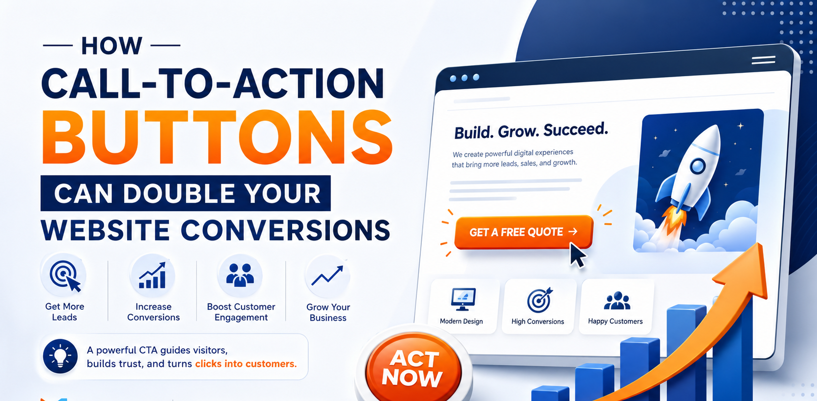
Your website may attract hundreds or even thousands of visitors every month, but if those visitors don’t know what to do next, you’re losing valuable business opportunities.
This is where Call-to-Action (CTA) buttons play a crucial role.
A well-designed CTA guides visitors toward taking the next step—whether it’s requesting a quote, making a purchase, booking a consultation, or contacting your team. Small improvements to your CTA strategy can significantly increase conversions and turn more visitors into paying customers.
What Is a Call-to-Action (CTA)?
A Call-to-Action is a button or clickable link that encourages visitors to take a specific action.
Examples include:
- Get a Free Quote
- Contact Us Today
- Book a Free Consultation
- Start Your Project
- Download Our Brochure
- Request a Demo
- Call Now
- Buy Now
- Get Started
Instead of leaving visitors wondering what to do, CTAs provide clear direction.
Why CTA Buttons Matter
Many websites lose potential customers simply because they don’t guide users effectively.
Strong CTA buttons help:
- Generate more leads
- Increase sales
- Improve user experience
- Reduce visitor confusion
- Encourage immediate action
- Improve overall conversion rates
Without clear CTAs, visitors often leave your website without taking any action.
Characteristics of High-Converting CTA Buttons
1. Clear and Action-Oriented Text
Avoid generic words like “Submit.”
Instead, use action-focused phrases such as:
- Get My Free Quote
- Schedule a Call
- Start Your Website Today
- Download Free Guide
- Contact Our Experts
Clear messaging encourages clicks.
2. Use Contrasting Colors
CTA buttons should stand out from the rest of your website.
Choose colors that contrast with your background while staying consistent with your brand identity.
A button that blends into the page is easy to overlook.
3. Place CTAs Where Visitors Need Them
Don’t limit your CTA to the bottom of the page.
High-performing websites place CTA buttons:
- In the hero section
- After important content
- On service pages
- In pricing sections
- At the end of blog posts
- In the website header
The easier it is to take action, the higher the conversion rate.
4. Create a Sense of Urgency
Encourage visitors to act now using phrases like:
- Limited Time Offer
- Get Started Today
- Book Your Free Consultation
- Schedule Before Slots Fill Up
- Claim Your Free Website Audit
Urgency helps reduce hesitation.
5. Keep Buttons Mobile-Friendly
More than half of website traffic comes from mobile devices.
Ensure CTA buttons are:
- Large enough to tap easily
- Visible without excessive scrolling
- Fast-loading
- Responsive across all screen sizes
A poor mobile experience can cost valuable conversions.
6. Reduce Distractions
Too many buttons on one page can confuse visitors.
Focus on one primary goal for each page.
For example:
- Service Page → Request a Quote
- Contact Page → Call Now
- Product Page → Buy Now
- Blog Page → Contact Our Team
Simple navigation improves decision-making.
7. Build Trust Around Your CTA
Visitors are more likely to click when they feel confident.
Place trust signals near your CTA, such as:
- Customer reviews
- Client testimonials
- Security badges
- Years of experience
- Money-back guarantee
- Trusted by 500+ Businesses
These elements reduce hesitation.
Common CTA Mistakes to Avoid
Avoid these common errors:
- Using vague button text
- Hiding CTAs below long content
- Using multiple competing buttons
- Choosing colors that don’t stand out
- Not optimizing for mobile users
- Failing to test different CTA designs
Even small mistakes can reduce conversions.
Test and Improve Your CTA Performance
The best-performing websites continuously test:
- Button colors
- Button size
- Placement
- Wording
- Icons
- Page layout
Regular testing helps identify what generates the highest conversion rates.
Final Thoughts
A Call-to-Action button may seem like a small website element, but it has a massive impact on business growth. The right CTA can guide visitors, increase engagement, and generate significantly more leads and sales.
If your website receives traffic but isn’t generating enough inquiries or conversions, improving your CTA strategy could be one of the most effective changes you make.
A clear, compelling Call-to-Action doesn’t just improve clicks—it helps turn visitors into loyal customers.
Need a High-Converting Business Website?
Kirali Web Services designs modern, conversion-focused websites with strategically placed Call-to-Action buttons that help businesses generate more leads, increase sales, and maximize their online success.